ROLE:
UX/UI Lead Designer
DURATION:
1 Year (ONGOING)
TEAM SIZE:
12
TOOLS:
Figma, Unity, Procreate, Aseprite
Japanese Salaryman

about.


Whole Game: Fight to escape debt in a world of corporate intrigue where reputation and information are your currency. Sell sensitive information & navigate office politics in this Office-noir RPG set in 1990s Japan.
Because this is an ongoing project, I will be focusing on the most recent mini-project and my process for that, which is the Surveillance game.
The surveillance game is the “work” part of Japanese Salaryman, where you work to gain as much money as you can through connective surveillance technology. You build up each technology’s components to get the most output you can by creating an interconnected system of surveillance. This portion of the game was made over an 8-week process and is still in development.
my responsibilities
As the Lead UI/UX designer, I was responsible for designing all interfaces and creating the UI assets within the game (HUD, strategy game mechanic, and minigame interfaces), as well as creating satisfying experience, working with programmers and designers on our team to implement my flows. Because our game is made to have over a 20 hour expected playthrough time, a large part of my designing was to ensure consistency throughout the entire game in terms of style.
challenge.
As the designers and I discussed on how to convey the information, we found it to be quite difficult to convey verbally because there was just so many components. Additionally, these components would all be intertwined with each other. It was only easier to understand by actually playing and with a guide to play by the designer. Our challenge was:
“How do we make this information that all correlated with each other actually feel connected, and easy to understand?”
This was actually a large leap conceptually from our last “day work”, as it was much more straight-forward (Simple choose A or B for effect choices). However, we felt it would get boring quick after repeatedly replying to emails for 30 in-game days, and there would be much more writing involved than we realized for the 20 hour intended playtime. So another problem was:
“How can we effectively transition our players from a simple AB choice-based game to a factory game?
ideation.
Sketches

There were some initial ideas for readability when we were first ideating, like some moving animation for each building component, like having each one that serves different purposes be a different shape, or converters (components that change the form of given material) having an animation like a printer. One thing that was clear was there needed to be some kind of iconography or clear shape to depict what each component did.
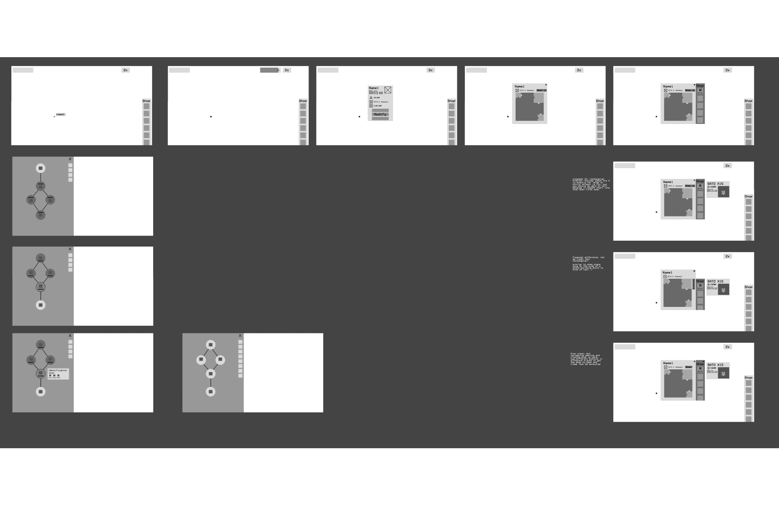
Wireframes of the initial user flow
Mid-Fis and Temporary Assets
After discussing with the Surveillance team about the UI, I went ahead and created temporary assets for the game to create a simple style to make in time for our playtesting event, following the initial style guide noted in the style guide section.
playtesting.
This was the time to test if my designs were readable, and made the game conceptually easier to understand! By utilizing our student organization's playtesting space, we were able to get feedback from first-time players.
key feedback notes

Top: Feedback chart from survey of difficulty in readability (1 was hard to read, 5 was easy to read)
Bottom: Feedback chart from survey of difficulty in understanding (1 was hard to understand, 5 was easy to understand)
improvements.
Although most of the UI was readable and understandable with most ratings at 4s and 5s, the biggest pain point was that the UI was hard to click on for play-testers. We originally thought that 2 px would work better in terms of sizing as the connector was also 2 px so it would smoothly connect without any gaps (specifically for the input), but it was at the cost of readability, so we will go back to our original design.
Going back to original design for the inputs and outputs (larger inputs and output area), and having a larger hitbox for all buttons
Design
The style guide is based off of actual surveillance cameras in the 90s. Though only adjacent in color in those blue green hues, reflect clearer flow of “data” with a bright yellow color. Additionally, interactable buttons and features that we wanted the user to utilize are denoted by a bright blue color.
What made this game much easier to read during playtesting was its iconography. With warning signs denoting errors in connection, and icons indicating what material was being produced, players were able to receive immediate feedback of what they needed to fix in their component builds.

Asset Sprite Sheet for Surveillance Game.
Accessibility
Because the components were in bright, neon colors, I wanted to ensure color accessibility. Because they were neon, it was hard to differentiate component differences with color, you are easily able to tell what component was what with the shape.

Side by Side comparison between Full color and Monotone screen.
results.
The finished model and photographs produced for STONE MIND exceeded expectations. The product photos delivered a powerful visual impact, highlighting the unique texture and structure of the stones under varied lighting. The model became a striking artistic centerpiece, serving both as an art piece and an effective marketing asset. The images were later used in campaigns and as inspirational visuals within design and art communities.
row 1 caption
screen captures of the beta version, made for playtesting.
reflection.
Japanese Salaryman has been a big part of my development as a UI/UX designer. I learned a lot about how to clearly communicate through my design choices.
I also gained experience iterating over my previous designs over a long period of time, iterating over my past designs from a year ago.

