Japanese Salaryman
Easing the learning curve for a complex game.

ROLE:
UI/UX Designer
DURATION:
1 Year (Ongoing)
TEAM SIZE:
8-12
TOOLS:
Figma, Unity, Procreate, Aseprite
Overview
Surveillance.
Overview
Build and Build
The surveillance game is the “work” part of Japanese Salaryman, a pixel RPG, where you work to gain as much money as you can through connective surveillance technology. You build up each technology’s components to get the most output you can by creating an interconnected system of surveillance.
This was made over an 8-week process and is still in development.
My Impact
Easing the learning curve of a complex system
???
Problem Statement
Our game was made over a few years, and designers had transitioned our "day-job" part from a simple 2-choice decision email minigame to a factorio-like building game.
Problem: There are a lot of components to think about compared to our last game. How do we ensure our 3000+ expected players can easily transition to the surveillance game without feeling a steep learning curve and maintain engaged?
Ideation
Rapid Ideation
Rapid-fire Ideation
Through extensive meetings with designers to gain a full understanding of what the user flow of this would be.
From there, we started ideating.
The biggest ideas were icons and shapes to ensure people could tell the difference between their components, not just with shapes.
There were ideas of Tetris shapes

Ideation session between UI/UX designer (me))and Game designer
To fully understand the vision, I wireframed the user flow, with indicators to
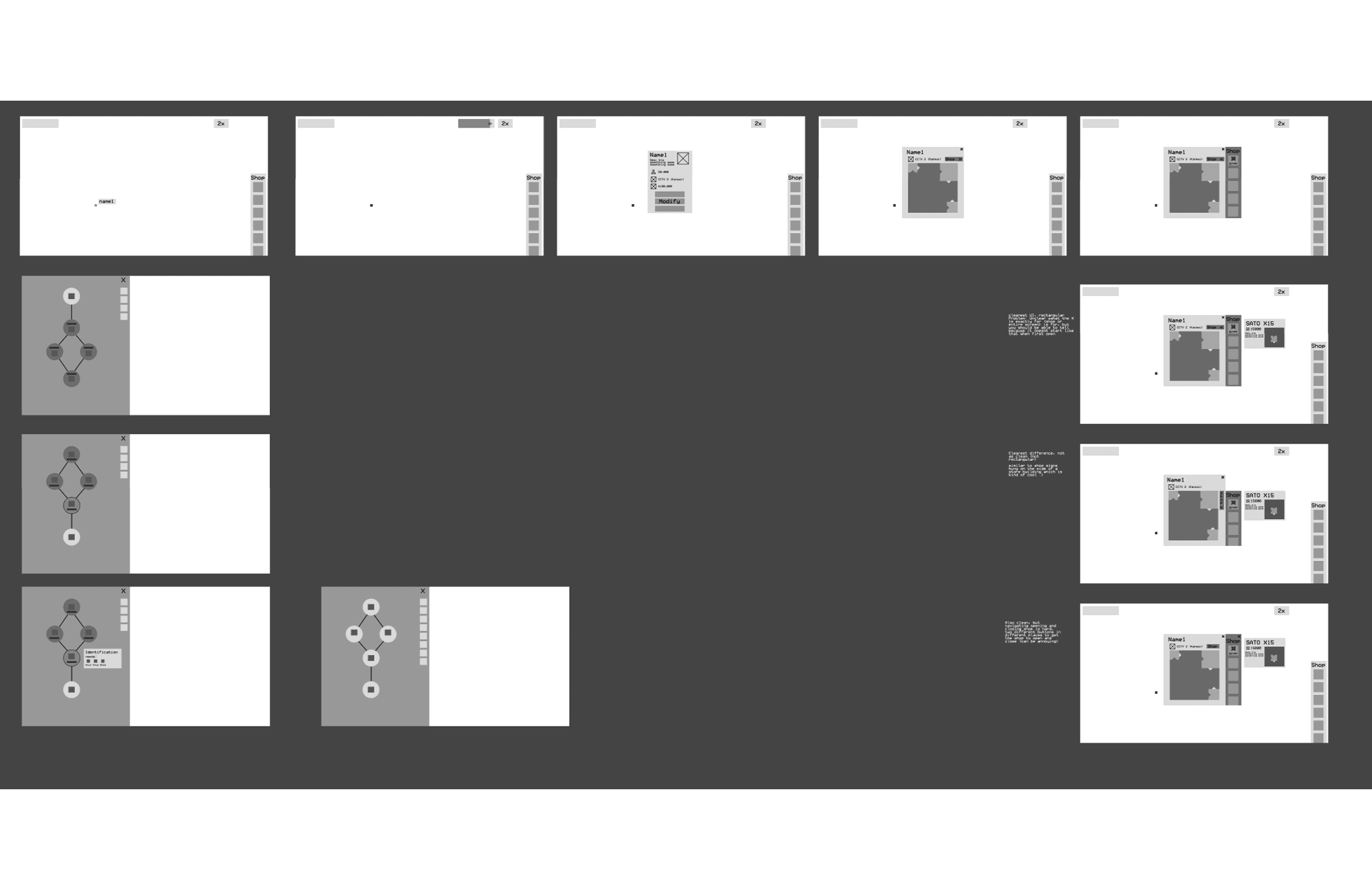
Wireframes of the initial user flow
User Testing
Playtesting, feedback, then Iteration
Key feedback Notes
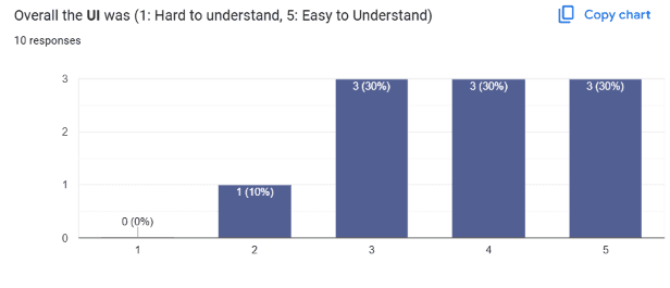
This was the time to test if my designs were readable, and made the game conceptually easier to understand. Below is the quantitative feedback on surveys and qualitative feedback during playtesting.

It had a really good feel. Everything was intuitive enough that you could figure out the game even if you get confused for a bit."
"UI elements were very difficult to click on"
"There were some parts that were a bit difficult to understand, like connecting multiple things (forgot what they're called) to get the hooks. The x at the corner of the pop-ups were hard to click."
Although most of the UI was readable and understandable with most ratings at 4s and 5s, the biggest pain point was that the connectors was hard to click on for play-testers.
Iteration
To fix this, we simply made the connectors much larger to click.
Design Process
Design Highlights
Inspirations
The style guide is based off of actual surveillance cameras in the 90s.

Before vs After Readability adjustments: More visuals, information categorized.
Consistent Styling
To ensure consistent colors were used for asset creation, I made a style guide, especially when different colors would be used also as indicators for different components.

Accessibility Features
Color Accessibility
Because the components were in bright, neon colors, I wanted to ensure color accessibility. Because they were neon, it was hard to differentiate component differences with color, you are easily able to tell what component was what with the shape.

Side by Side comparison between Full color and Monotone screen.
Iconography
What made this game much easier to read during playtesting was its iconography.
With warning signs denoting errors in connection, and icons indicating what material was being produced, players were able to receive immediate feedback of what they needed to fix in their component builds.

Side by Side comparison between Full color and Monotone screen.
Style Guide
Consistent Styling
Because we were working in a remote setting, each person was tasked to design each page. To ensure style consistency, yet freedom to create, we utilized a style guide, detailed with how to use each component to design very early on.
All components completely labeled.
Reflection
Process really matters
This project was definitely challenging to navigate around, and I definitely felt that
Playtesting is crucial
Feedback was so crucial to confirming that our designs actually worked. When working on it with only developers, checking it with fresh eyes really made a difference in our confidence to move forward with our designs. Through playtesting, we were able to ensure that our designs were clear and readable.
Confirmation with team
Initially, the game was conceptually difficult to explain. Once played, it was easier, but because UI/UX designs

