ROLE
UX
TEAM SIZE:
6
TOOLS:
Figma, Unreal Engine 5, Procreate
GENRE:
Third-Person Shooter
EXO

about.


EXO is a third person movement shooter, where speed is the ultimate weapon. Players shoot and obliterate enemies, tear out their souls to use as fuel, and fully indulge in their power-and-adrenaline fantasies.
project overview.
My task was to ensure that the (1) UX felt good, (2) aligned with the goal of “feeling fast”, and (3) all information was easily readable & accessible. My workflow consisted of designing in Figma, implementing in Unreal via Blueprints, and play-testing and iterating until UX goals were met.
challenge.
EXO is based on speed, so the gameplay is fast, and you need to look at both enemies and plan your direction.
Speed is the game. Run. Run fast. Enemies are in your way and you destroy them with your shooter weapon. You dodge and weave around the circular planet that is your map. Until you get to a certain speed, you can’t take off to progress. At high speeds, you only care about what’s in front of you. Because of this, the information you get from the UI needs to be quickly taken in. The player is looking almost entirely at the reticle, however they still need information.
How might we ensure players have access to the status of their character quickly?
How can we ensure players are focused on the speed of the game?
ideation.
Sketches

Initial Screens of the Soul Bar and speedometer

Biggest inspirations for the HUD layout and experience design (Peak, League of Legends, Overwatch 2).
We took inspiration from the game, Peak, as they have one bar for everything too. It was simple, you need energy to climb, and injuries would limit how much energy reserve you have. It was the same for EXO. The more damage the player takes, the less soul reserve they have.
largest inspirations.
The biggest focus in the design was to make sure the user had access to information easily, but still made sure the UI wasn’t taking up the whole screen. The benefit to our current UI was that we had thin lines, so in gameplay it wasn’t very distracting and still had the main focus of attacking enemies.
Though the style was pretty solidified, I was responsible for the redesign after the down-scoping of our project & finalizing the HUD (going from 6 weapons down to 3), thus why I was mainly working from mid-fis.
iteration.
I mostly took in feedback from my teammates, as it was the most immediate feedback to iterate on. I took in weekly feedback from them as we had progress checks every week. Below were the main pain points and feedback over the course of development, and changes made based on feedback.
feedback
What was difficult about sketches and wireframes was trying to visualize how effective and readable the UI elements were without real-time feedback from the game. To better visualize I learned how to blueprint and implement UI + effects in UE5 here to test speed mechanics through EXO with the assistance of our current gameplay engineer to really flesh out how it feels and looks.

Implemented Fade-in feature, increases in opacity as you take on more damage.
improvements.
For readability, we made sure that the lines were thinner so the main focal point (crosshair area) didn’t feel covered by the UI. The biggest issue was the fact that most players did not notice the UI, like the goals and at all, even as it was constantly on screen. What we found the solution was subtle indicators of what we wanted to tell, and put static information like goals closer to their field of vision (middle)
adding an information tab on HUD for speed goal and timer
Moving the goals to the top instead of the side so it would be within the player's field of view
clearer indicators like the fade-in for dmg using effects with fade in when high damage occurred
pre damage indicator to indicate this was damage being inflicted
Moving the damage meter closer in proximity to the player’s field of view
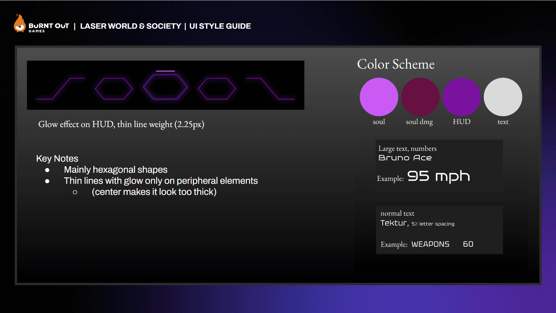
Style Guide
General style guide was given to me by the previous UI/UX designer, but I was able to finalize it, making edits and detailing the style in the Art Bible for consistency.
result.


reflection.
There is still much to polish and improve on based on the feedback we received, so this project is not complete yet!
I have learned so much through this process, however, specifically the importance of temporarily implementing to test your designed experiences, as for fast paced games like this one, movement is so crucial. Static screens just don’t cut it when it comes to making UI like this. Learning how to implement and blueprinting has been such a rewarding experience, and really opened my eyes to what I could really do.
I am excited to further polish and refine my designs!
Thank you for reading :).

