EXO

ROLE:
UX/UI Technical Designer
DEVELOPERS:
11
TOOLS:
FIGMA, UE5, PROCREATE
GENRE:
Third-Person Shooter
Overview
Thrill of Speed
EXO is a third person movement shooter, where speed is the ultimate weapon. Gameplay is set on spherical planets, letting players orbit, leap between planets, and chain high-velocity maneuvers.
Over the course of 2 10-week sprints, I was responsible for finalizing the in-game UI, from initial designs, UX research, and UI design to ship on Steam.
My workflow consisted ofby designing in Figma, implementing in Unreal via Blueprints, and play-testing and iterating until UX goals were met.
The Product
Final Mockups & Screens
HUD
Ensure player is able to read critical information at the right time.
Opt for more visual indicators & bars instead of reading numbers.
Hook up and implement all visual features.

Settings Menu
Ease of navigation.
Aligned with current style of UI.
Design and hook all visual features

End Screen
Motion design for high impact scores.
Player feels impact of their gameplay.
Hook up all score information given from programmers.

Design Process
HUD
EXO is based on speed, so the gameplay is fast, and you need to look at both enemies and plan your direction. So, I asked:
"How might we ensure players know the status of their character quickly?"
"How can we ensure players are focused on the speed of the game?"
Research
As a fast-paced shooter, speeding through maps, I thought of racing games, and asked racing simulator devs what they used to use for crucial information.

Racing game often had large visuals or right in the center within the field of vision to ensure they get all the complex information they need quickly.

Lo-fi mockups vs finalized screen
User Feedback: Needing Clearer Indicators
We continuously tested throughout our development, both internally with our team, and during playtesting nights. This is the feedback we got:
“I am barely looking at the UI at all”
Players were not observing the health bar or the speedometer.
Soul bar was confusing to the player, as they didn’t understand what the damage meant at first
So we changed:
Centralizing all important information
Less text, if needed, there are pop-up text for indicators
Powerups on the right-hand side (for balance)

Before Visual Adjustments

After Visual Adjustments
With these changes, players:
Understood the goal of the game instinctively.
Continuously sped up as goal was built into the spedometer.
Understood how and when they were taking damage.
End Screen
High Impact game, High Impact Score
User Testing
Numbers and Impact as a driver
During previous playtesting before final scores, players only played once or twice, but after implementing a scoring system, with animated incrementing stats and final Tier grading.
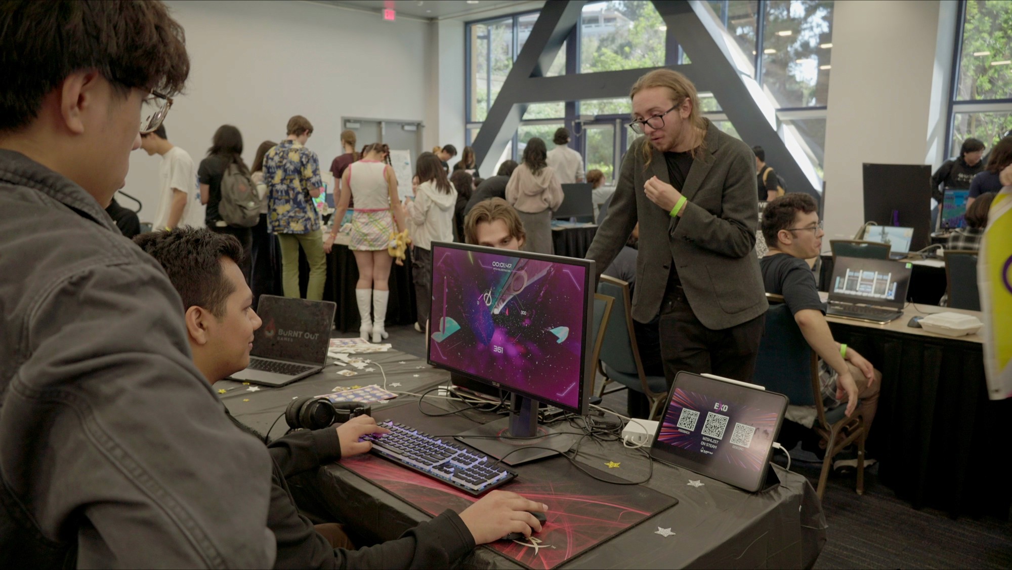
Players coming back to play 2-3 times after walking around the showcase!

Sample of Final Score
Settings Menu
Iterations, grouping
There are a lot of settings adjustments with EXO to ensure best testing.
By A/B testing with fellow developers in other disciplines, and going through rapid iteration, I was able to figure out what was the most readable to players.
The most helpful for readability was:
Grouping related settings together
Notes detailing what each component does
Clear fonts for details and smaller text

Iterations of the settings organization, getting feedback from team for what was most readable. Rightmost was the finalized.
What are the most crucial settings?
To determine what settings are needed to be implemented, I consulted our gameplay engineer to figure out what was essential for testing.
The other factor also came from playtesting. We developed custom accessibility toggles like aim assist, as during playtesting sessions, I had noticed how difficult it was for some players to control their aim at extremely high speeds (300+mph).
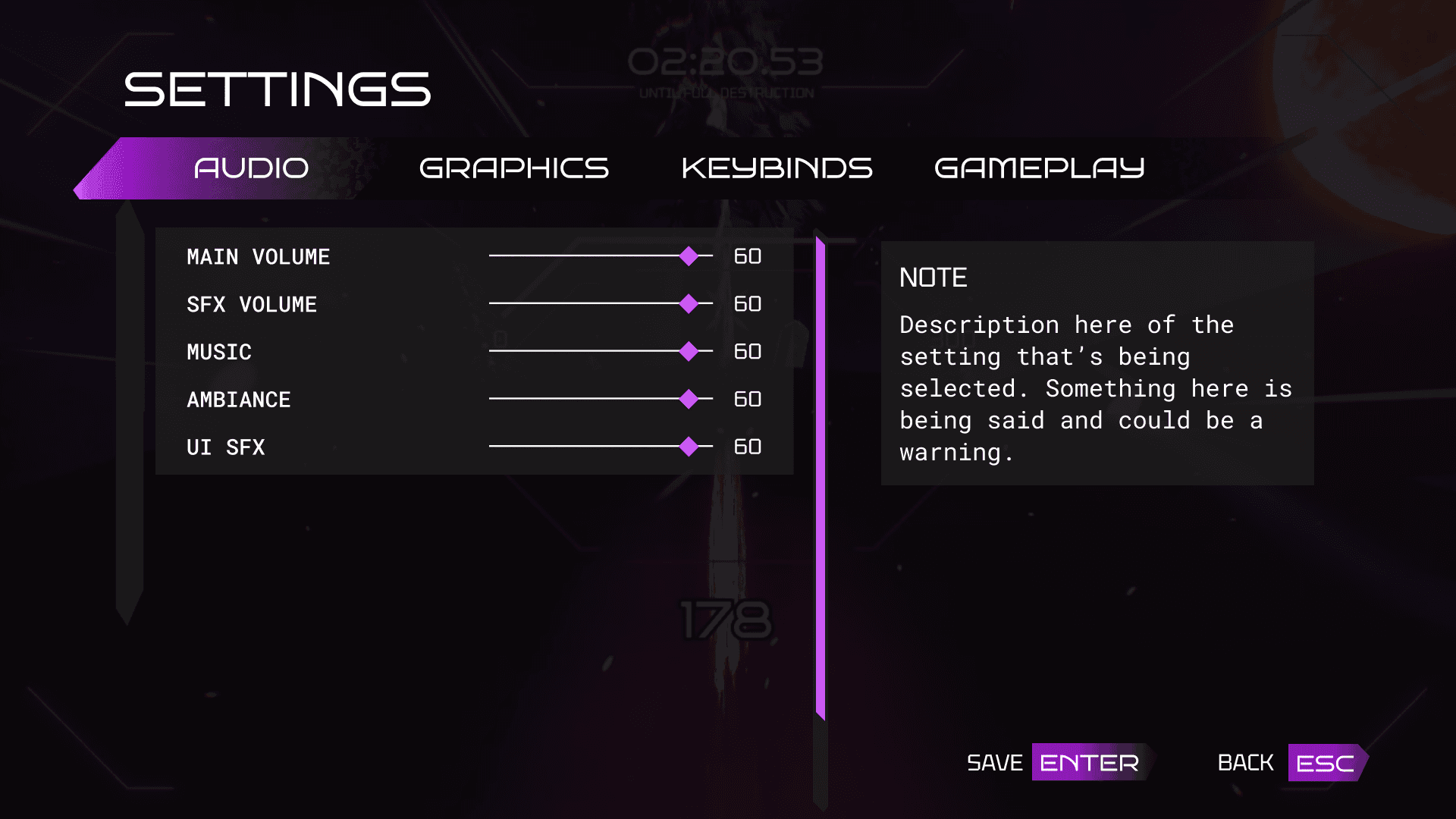


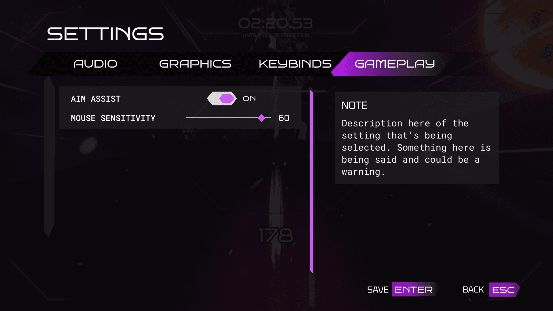
Decided categorization of each tab in the main settings menu.
Reusable components in UE5
To ensure consistency when implementing, I separated out the bar, notes, and type of settings.
And for each toggle and selection bar, using a child component that's editable to build each settings category.
Style Consistency
To keep in style with the rest of the game, we kept the "decay" theme throughout through fade-out gradients and that soul color.
Fade out highlights, clean sleek
Reflection
Continuously learning
This project really allowed me to experience what design consistency looked like throughout an entire larger-scale project.
It had also challenged me as a technical designer as well, as I was responsible for implementing all my designs. This was my first time in UE5 blueprints.
Here are some of the things I learned:
Reflection #1: Cross-disciplinary collaboration is crucial
Cross-disciplinary collaboration was crucial for our project. Being able to get feedback from the gameplay engineers for clarity on what was needed for players to understand the game was crucial.
Confirming with the environmental artists on what the environment would be themed after fostered consistency and polish through cohesion between UI and environment.
Reflection #2: The impact of feedback on development team
Quantitative data and qualitative feedback not only confirmed our designs to be effective, but really drove our team to improve. It proved that my work was effective, and the effort of my iterations and research directly impacted immersion of the game, which then continuously drove me to improve on my work.
Showcase


